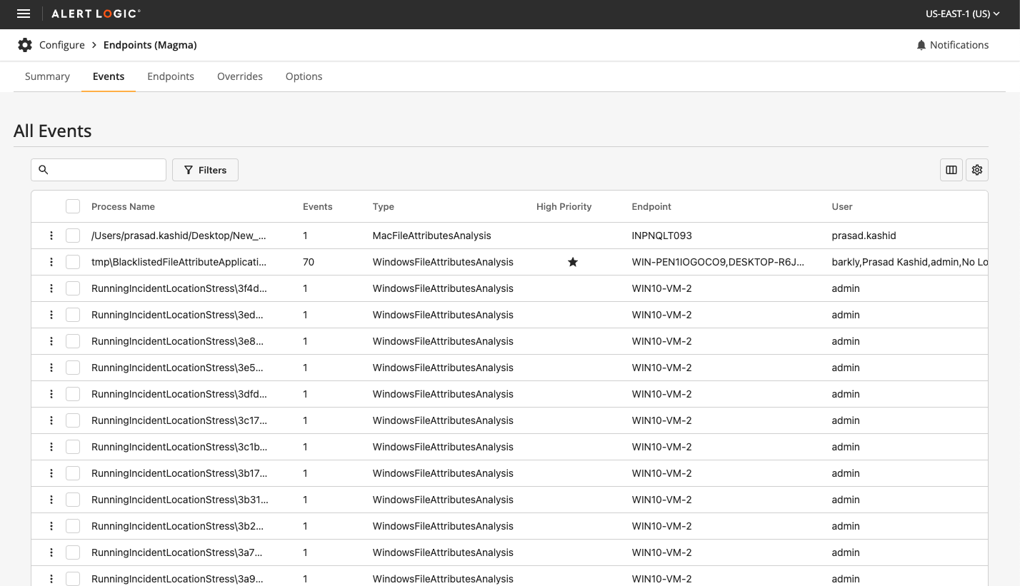
Crafting Digital Experiences

Two decades of design evolution

As a Full-Stack Designer at Raptor Technologies, I bridge the gap between creativity and functionality in the education and safety sector. From my studio in the Pacific Northwest, I transform complex challenges into intuitive solutions that protect and empower communities.

Design Leadership

Guiding projects from concept to completion with a focus on user-centered design systems and pattern libraries

Technical Mastery

Leveraging modern frameworks and tools to build responsive, accessible digital experiences

Creative Process

Combining UX research, rapid prototyping, and iterative design to solve complex challenges

Collaborative Impact

Working across teams to deliver solutions that drive measurable results and user satisfaction

My approach combines strategic thinking with hands-on expertise in tools like Figma, Adobe Creative Suite, and modern web frameworks. I specialize in creating accessible, scalable design systems that empower teams and delight users.

hello and welcome!

about me
Crafting Digital Experiences with Creativity & Science

Hello! I'm Poem Pitzer, I am a Full-Stack Designer, currently engaged in contract work with Raptor Technologies, where I am dedicated to enhancing digital education and safety. With over 20 years of experience in the design industry, I specialize in transforming complex challenges into intuitive and engaging user experiences. My expertise spans UX/UI design, system integration, and modernization, enabling me to bridge the gap between design and technology to create seamless and effective products. My work is characterized by a holistic approach that ensures visual consistency, robust functionality, and user-centric solutions.

Professional Journey

Starting my career at PRWeb, where the fast-paced environment taught me the essence of agile design, I've navigated through roles that refined my expertise and expanded my horizons. At Alert Logic, I led the design of a SaaS cybersecurity suite, unifying multiple product interfaces into a singular, cohesive experience. Now at Raptor Technologies, I continue to bridge the gap between technology and users, ensuring seamless interactions across digital landscapes.

Design Ethos

My design philosophy is simple: understand the user, challenge the norms, and never stop iterating. Leveraging tools like Figma, XD, and Sketch, I craft designs that are not only aesthetically pleasing but also functionally robust. Every stage of the design process, from wireframes to high-fidelity prototypes, is an opportunity to enhance user satisfaction and business success.

Collaboration and Innovation

I thrive on collaboration, working with cross-functional teams to deliver solutions that align with strategic business goals while exceeding user expectations. As a remote work veteran, I've honed my ability to communicate and collaborate effectively, no matter where I am.

Life Beyond Pixels

Outside the office, the Pacific Northwest's natural splendor inspires me. From drawing and painting to gardening and rock hounding, my hobbies reflect the deep, design-driven insights found in everyday life.

my portfolio

works
  • Raptor Design System

    Raptor Technologies

    As a Full-Stack Designer at Raptor Technologies, I advanced the Raptor Design System by unifying scattered components, introducing scalable design tokens, and ensuring cross-platform consistency between Figma and Storybook. This work improved design scalability, consistency, and collaboration, fostering a cohesive user experience across Raptor’s product ecosystem.

    Figma
    Storybook
    Design Tokens (Variables & Primitives)
    Cross-Platform Consistency
    Design System Architecture
    Collaborative Design
    UI/UX Design
    Scalability
    Component Unification
    Cross-Team Collaboration
    Developer Handoff Optimization
    Visual Consistency
    Design Audit
  • React Portfolio Site

    Personal Project

    Developed a single-page portfolio application to showcase my skills and experience. Leveraging a decade of experience in TypeScript across various technology stacks, I focused on both UX and UI integration, creating and styling components, and using JavaScript. This project allowed me to test and refine my knowledge in modern web development, ensuring a cohesive and visually appealing user experience.

    UX Design
    UI Development
    React
    Javascript
    Component-Based Architecture
    Styling and Theming
    Problem Solving
    Self-Driven Learning
    Responsive Design
    Accessability
  • Dismissal Management Integration

    Raptor Technologies

    Integrated a newly acquired Dismissal Management product into Raptor Technologies' suite, ensuring design consistency and enhancing user experience, while redesigning key components to optimize interfaces and improve usability and functionality of dismissal processes.

    UX Design
    UI Development
    Design Systems
    Visual Consistency
    Figma
    Storybook
    Material Design
    Angular Material
    Problem Solving
    Collaboration
    Leadership
  • Alert Logic Design Systems

    Alert Logic

    As a Senior UX Designer, I developed comprehensive design systems at Alert Logic, enhancing product consistency and streamlining workflows. At Alert Logic, I created a unified design library, while at Raptor, I integrated the Feather UI Storybook with the Design System for improved consistency and scalability. These efforts significantly boosted design coherence and efficiency across both companies.

    UX Design
    UI Development
    Design Systems
    Visual Consistency
    Figma
    Adobe XD
    Storybook
    Material Design
    PrimeNG
    Problem Solving
    Collaboration
    Leadership
  • Redesign: SASS Cybersecurity Console

    Alert Logic

    Led the integration of multiple security management consoles into a unified platform at Alert Logic, enhancing functionality and user experience. This project involved redesigning existing systems and implementing a cohesive technology stack with NGINX, improving overall system efficiency and scalability.

    UX/UI Design
    System Architecture Design
    Front-end Development
    Project Management
    Systems Integrations
    Prototyping
    Wireframing
    Technical Documentation
    Performance Optimization
    Problem Solving
    Collaboration
  • Dashboards Project

    Alert Logic Console Enhancement

    Enhanced the Alert Logic console with interactive dashboards to streamline cybersecurity monitoring and response, featuring user-friendly designs in multiple display modes and powered by Highcharts.

    UX/UI Design
    Adobe XD
    Data Visualization
    Interactive Design
    User-Centric Design Principle
    Highcharts Integration
    Cybersecurity Analysis
    Dashboard Development
    Research & Development
    Responsive Design
    Cross-Functional Collaboration
  • Configuration Console

    Alert Logic

    Spearheaded the redesign of the Alert Logic Configuration Console, enhancing user control and flexibility in security management for AWS environments. Streamlined the user experience, improved asset management, and integrated sophisticated scheduling capabilities.

    UX/UI Design
    Adobe XD
    Research
    Project Management
    Security Best Practices
    Customer Experience Design
    Agile Development Methodologies
    Stakeholder Engagement
  • Rapid Prototyping: Endpoints

    Alert Logic

    Developed a rapid prototype for the Endpoints console at Alert Logic, leading to a seamless UI update and improved table designs across the product.

    Rapid Prototyping
    UI/UX Design
    Angular Development
    Storybook Integration
    Custom Component Development
    Collaborative Design & Development
    User Interface Enhancement
    Front-End Development

React Portfolio Site Development

portfolio

project overview

01

This project involves developing a single-page portfolio application designed to showcase my skills and experience in UX and UI integration. With a decade of experience across various technology stacks, the goal was to create a visually appealing and functionally robust portfolio site using React and JSX. This project also marks my first experience working with React.

Objective

The main goal was to create a one-page portfolio website that demonstrates my expertise in modern web development, specifically focusing on:

  1. Highlighting my skills in integrating UX and UI.
  2. Showcasing my proficiency in React and JSX.
  3. Developing a visually appealing and unified user experience
  4. Gaining practical experience with React for the first time."

Challange

The main challenges included:

  1. Ensuring a seamless integration of UX and UI elements.
  2. Developing and styling custom components to create a unique and engaging design.
  3. Managing application state effectively to provide a smooth user experience.
  4. Learning and applying React concepts and JSX for the first time to build a robust application.

Proposal

02

To address this challenge, I proposed:

  1. Designing and developing the portfolio site using React, leveraging its component-based architecture for modularity and reusability.
  2. Utilizing JSX to ensure efficient and effective UI rendering.
  3. Implementing responsive design principles to ensure the site looks great on all devices.
  4. Creating custom components and styling them to align with a cohesive design language.
  5. Incorporating a dark mode switcher to enhance user experience.
  6. Ensuring the site is accessible by adhering to web accessibility standards (WCAG), such as providing alternative text for images, using semantic HTML elements and ensuring sufficient color contrast.
  7. Continuously learning and applying React best practices throughout the development process.

Key Features

03

Before the integration of the new centralized dashboard system in the Alert Logic console, the cybersecurity management tools were dispersed across various individual consoles. Each of these previous dashboards was specialized but operated in isolation, which presented several challenges

  1. Component-Based Architecture: Built with React to ensure modularity and ease of maintenance.
  2. JSX Integration: Ensured efficient and effective UI rendering.
  3. Custom Styling: Developed and styled custom components for a unique look and feel.
  4. Responsive Design: Ensured the site is fully responsive and looks great on any device.
  5. Dark Mode Switcher: Included a dark mode switcher to enhance user experience and accessibility.
  6. User Experience Focused: Integrated UX principles to create an engaging and intuitive user experience.
  7. Accessibility: Ensured the dashboard adheres to web accessibility standards (WCAG), including alternative text for images, semantic HTML and sufficient color contrast.

Conclusion

06

The React Portfolio Site Development project was a self-driven initiative to test and refine my skills in modern web development. The goal was to build a single-page application that highlights my experience in UX design, UI integration, and technical proficiency with React and JSX. Throughout the development process, I focused on creating a visually appealing and functionally robust portfolio site with custom components and styles. Challenges included integrating UX and UI elements seamlessly while managing the application's state. By successfully completing this project, I solidified my understanding of React and JSX and enhanced my skills in component-based development.

Redesign: SaaS Cybersecurity Console

portfolio
Dashboards

Early Initiatives: Modernizing Core Capabilities

01

In 2014, I joined Alert Logic with a mission to revitalize the user experience and functionality of the company's suite of cybersecurity products. My initial focus was on enhancing three critical areas: threat management, log management, and search capabilities. These foundational improvements were crucial, as they directly enhanced the efficiency and usability of our core service offerings.

Technology Stack

Angular
Material Angular

Design Tools

Adobe Creative Suite
Sketch

Previous Consoles

Expanding the UX Frontier

02

Building on the success of the initial modernizations, I led the development of several new consoles that would further expand our capabilities and streamline user operations. This phase included the creation of specialized consoles such as:

  1. Topology and Remediations Console: Providing a clear visualization of network structures and associated vulnerabilities.
  2. Incidents Console: Manages and displays detailed information on security incidents identified by Alert Logic analysts. This console enhances incident response capabilities by allowing users to quickly assess and address potential security threats within their environment.
  3. Configuration Console: Configuring environments between AWS and data centers, setting up environments for the cybersecurity product to ensure seamless operations and security management across platforms.
  4. Exposures and Notifications Consoles: Tracks and manages potential vulnerabilities detected in the user's system. It provides functionalities to view and handle exposures and their corresponding remediations efficiently, with advanced filtering options to prioritize security actions.
  5. Health Console: Offering real-time insights into the health metrics of various systems, ensuring robust monitoring.
  6. Dashboards Console: Delivering customizable views for key metrics and alerts, facilitating quick assessments and decisions.
  7. Threat Intelligence Center Console: Enhancing visibility into cybersecurity threats, this console organizes Analytics, Log Parsers, and IDS Signatures into accessible tabs. It streamlines navigation and improves decision-making by presenting detailed security data in an interactive, tabular format for efficient user access.
  8. Reports Console: Offers comprehensive access to a range of security and compliance reports. This console aggregates and analyzes data on risks, threats, vulnerabilities, and compliance status, enabling informed decision-making through interactive and detailed reporting features.
  9. Vulnerability Library: Serves as a repository of all detectable vulnerabilities by Alert Logic scanners. This console allows users to search and view detailed information on vulnerabilities, facilitating proactive security measures and improved management of potential risks.

Each console was designed with a focus on usability, ensuring that they met the needs of diverse user groups from IT professionals to security analysts.

Technology Stack Migration and Integration Migration and Integration

03

As we developed and enhanced the various consoles at Alert Logic, a strategic decision was made to standardize and unify our technology stack to streamline development, improve maintenance, and enhance scalability. This transition involved adopting and integrating several cutting-edge technologies, including:

  1. Angular and Angular Material: Utilized for building dynamic, responsive user interfaces across the dashboard and other interactive consoles.
  2. NGINX and PrimeNG: Chosen as the core platform for its robust performance, reliability, and ability to handle complex security data traffic efficiently.
  3. Adobe XD and Figma: Employed in the design phase to create cohesive and user-friendly UI/UX designs, which were crucial for the usability improvements across all consoles.
  4. AWS Services: Integrated to ensure robust, scalable cloud infrastructure support, facilitating seamless operations between data centers and cloud environments.

This migration was crucial for supporting the diverse functionalities of the newly developed consoles, such as real-time data processing, complex queries, and automated responses, which are essential for effective cybersecurity management. By moving to a unified technology stack, we ensured that all components could interact seamlessly, providing a stable and efficient platform that could scale with the growing needs of our cybersecurity operations

Updated Alert Logic Consoles

04

Incidents Console

The Incidents Console serves as the central hub for managing security events flagged by Alert Logic's analysts. It facilitates efficient incident management by allowing users to view detailed information about each identified incident, supporting prompt action to secure environments and close vulnerabilities.

Exposures Console

This console identifies and manages potential security vulnerabilities detected in the user's environment. It features a dual-view capability for both exposures and their corresponding remediations, with robust sorting and filtering options to prioritize response based on severity, impact, and other criteria.

Health Console

The Health Console monitors and displays the health status of networks, appliances, and agents, providing critical notifications and enabling users to filter and view data based on health status, network, and deployment types. This tool is essential for maintaining the overall integrity and performance of the infrastructure.xt

Automated Response Console

Designed to streamline the response to common security threats, this console allows users to set up and manage automated actions, integrate with other technologies, and monitor the effectiveness of these responses, ensuring proactive management of security incidents.

Search and Investigation Console

This console enhances investigative capabilities through advanced search functions for log messages, IDS events, and FIM data. It supports both simple and expert mode queries, allowing for both broad and granular analysis, and includes features for managing saved searches and correlations.

Topology Console

The Topology Console provides a visual representation of the user’s network environment, including VPCs, VNETs, subnets, and hosts. It offers interactive tools to manipulate and explore network details, enhancing understanding and management of the network structure.

Vulnerability Library

This console lists all vulnerabilities that Alert Logic scanners can detect, allowing users to search for and view detailed information on vulnerabilities affecting their environment, thus aiding in the prioritization and management of security patches and updates.

Threat Intel Center

The Threat Intelligence Center console delivers insights into the latest security threats by displaying detailed, interactive lists of security content. This tool is crucial for staying updated on emerging threats and enhancing the security measures in place.

Reports Console

The Reports Console aggregates and displays data related to exposures, incidents, vulnerabilities, and compliance status, offering various reports like risk, threat, vulnerability, remediation, compliance, and service usage reports to aid in comprehensive security and health assessment.

Configuration Console

This console is pivotal for setting up and managing the configurations between cloud services like AWS and on-premises data centers. It includes tools for managing deployments, adjusting settings, and ensuring that the cybersecurity infrastructure is optimally configured for both performance and security.

Building a Sustainable Design System

05

Parallel to these integration efforts, I recognized the need for a robust design system to ensure consistency across our expanding suite of products. I spearheaded the creation of a centralized design system and pattern library using Adobe XD, Figma, and Storybook. This system set the standards for typography, color palettes, spacing, iconography, and interaction patterns, significantly improving design coherence and development efficiency.

Integrating into NGINX: A Unified Platform

06

Following the technology stack migration, the integration of the nine distinct consoles into a single, cohesive platform powered by NGINX represented a pivotal advancement in our cybersecurity management capabilities. This unified platform not only simplified the user experience but also leveraged the full potential of our integrated tech stack to enhance performance and security.

  1. Unified Incident and Exposure Management: Integrates incidents and exposures functionalities, providing a comprehensive view of security threats and responses.
  2. Advanced Health Monitoring and Dashboard Functionality: Combines health metrics and customizable operational insights, enhancing monitoring and decision-making capabilities.
  3. Enhanced Threat Intelligence and Reporting: Merges threat intelligence and detailed reporting functionalities, enabling streamlined access to real-time data and analytics.
  4. Comprehensive Vulnerability Management: Incorporates the Vulnerability Library, ensuring detailed vulnerability information is readily available for proactive management.

Each console was designed with a focus on usability, ensuring that they met the needs of diverse user groups from IT professionals to security analysts.

Conclusion: A Testament to User-Centric Innovation

07

The journey at Alert Logic has been a testament to the power of strategic UX design and system integration in the complex field of cybersecurity. By leading these initiatives, I not only enhanced the operational efficiency and user satisfaction but also established a scalable framework that supports ongoing innovation and adaptation. This portfolio story encapsulates my role in driving significant technological advancements and user experience enhancements, underscoring my commitment to excellence and innovation in UX design within the cybersecurity domain.

Configuration Console: Alert Logic

portfolio

project overview

01

As part of a strategic pivot to enhance Alert Logic's value proposition, we embarked on an ambitious project to redesign the customer configuration experience. The goal was to simplify complex security setups and empower customers with a straightforward, outcome-focused user interface. This initiative was vital for customers to articulate their security needs clearly and manage their assets with precision.

The Challenge

Customers faced challenges in effectively declaring and managing their security configurations. The existing process was cumbersome, making it difficult for customers to specify their requirements and control access to their infrastructure. There was a pressing need to streamline these processes to improve customer satisfaction and operational efficiency.

Solution strategy

02

I developed a comprehensive configuration console that addresses multiple customer needs through a clear and intuitive UX/UI. This solution includes:

  1. Security Declaration: Customers can now easily declare their security needs, ensuring all required assets are protected according to their specific requirements.
  2. Access Control: The system allows customers to specify the level of access granted to Alert Logic, enhancing their control over security management.
  3. Deployment Mode Selection: Users can select a deployment mode that aligns with their business processes, improving the integration and efficiency of security implementations.
  4. Asset Management: The configuration console enables customers to declare and manage both internal and external assets, including DNS names and IP addresses, for comprehensive protection.
  5. Cost Control: By specifying which assets should not be protected by certain methods, customers can manage their security costs more effectively and minimize potential disruptions.
  6. Agent Management: The platform provides options to restrict agent updates during specific timeframes, aligning with internal business processes and reducing operational disruption.
  7. Notification Setup: Users can configure notifications for detected exposures, allowing for immediate action to mitigate risks.
  8. Scheduling Flexibility: The system offers enhanced scheduling options for scanning external assets, ensuring security measures are performed without impacting customer operations.

Technical Implementation

03

The solution was implemented using a modular design approach, allowing for easy navigation and management of configuration settings. We employed advanced web technologies to ensure a responsive and dynamic user experience, catering to a diverse range of customer needs. The integration with AWS services was streamlined through the use of IAM roles and permissions, ensuring secure and efficient access to customer environments.

Customer Impact

05

This redesigned configuration console significantly improved the user experience, making it easier for customers to manage their security settings and comply with regulatory requirements. The intuitive interface and flexible options have been well-received by customers, leading to increased satisfaction and enhanced security posture.

Reflection

04

This project not only transformed our configuration management process but also reinforced Alert Logic's commitment to delivering user-centric solutions that empower customers to manage their security with confidence and ease. It was a testament to the importance of listening to customer feedback and continuously evolving our offerings to meet their changing needs.

This portfolio story illustrates the challenges, strategies, and outcomes of this significant project, showcasing my skills in UX/UI design, project management, and customer-centric solution development in the cybersecurity landscape.

project: Documentation

Configuration

View XD Prototype

01

*Warning: This page is very long. This project also included documentation for Data Centers but I will only be showing the deliverables for the AWS customer journey.*

The Problem

02

As part of the pivot on the Alert Logic Value proposition, we need to solve a myriad of customer configuration problems to provide a simple outcome-based User Experience.

Configuration Problem Statements

03
  • I NEED to be able to declare my security needs SO THAT I know what configuration (protection) work needs to be done to obtain my intended outcome.
  • I NEED to be able to allow Alert Logic the appropriate level of access to my assets SO THAT I'm in complete control of access to my infrastructure/assets.
  • I NEED to be able to declare a deployment mode for my appliance(s) SO THAT provisioning/configuration is in line with my business process(es).
  • I NEED to be able to declare which assets I would like to protect against my intended Security Needs SO THAT I can be sure that all of the assets I require to be in scope are adequately protected.
  • I NEED to be able to declare a set of external assets in my deployments (DNS names, IP Addresses) SO THAT Alert Logic knows which assets to externally scan when a scan is scheduled.
  • I NEED to be able to express rules against which assets I shouldn't protect specifically by collection/detection method SO THAT I'm in control of costs associated and any possible impacts against business continuity.
  • I NEED to be able to stop some of my agents from being updated during a specific time box SO THAT I can adhere to my internal business processes (SRE, PRB, CAAB etc.).
  • I NEED to be able to understand where I need to install agents SO THAT I can make sure I'm adequately configured with Alert Logic.
  • I NEED to be able to set up meaningful notifications for exposures found in my deployments SO THAT I can take action to mitigate the risk associated.
  • I NEED to be able to limit the schedule for scanning against the external assets I’ve declared SO THAT I can gain the security value that Alert Logic provides.

Roles & Goals

04
  • Buying Decision Maker: Anyone in the catchment of our marketing teams
  • Consumer of Value: Incident Responders, Remediation Teams, Security Professionals, Compliance Professionals, Auditors
  • Configuration: Anyone tasked with integrating with Alert Logic

Customer Experience Path

05
  1. Signup
  2. Onboarding / Initial Experience
  3. Deployment Creation
  4. Apply Protection
  5. Value

Signup

06
  1. Sales sells the product "Awareness" or "Detection"
  2. Marketplace
  3. Inputs:
    • Which product purchased
    • Billing model (MRR, UBB, ...)
    • Customer structure (which accounts, users, ...)
    • Data residency
    • Customer segment data (for BRI)
  4. Outputs:
    • Customer created
    • Flags set = is new world customer
    • Subscriptions / entitlements set
    • Sales + lead generation reporting

Onboarding / Initial login

07
  1. Inputs: From Step 1
  2. Outputs:
    • Educated customer (per-user experience)
    • Orientation toward next step

Deliverables

08

Onboarding

This is the place where we can introduce the high-level product features for all new users. This must only show on their first-time login to the product and should not appear later (for testing purposes before launch, we should have a way to navigate to it in the address bar).

**The content here is still to be defined by Product and InfoDev.**

After going through the onboarding screens, the user lands on the Configuration page. An empty state is shown that encourages the user to create a deployment or view the tutorial for more help.

The other primary nav pages of the product are available before a user has created a deployment (this is new functionality). Each page has a unique empty state that displays the following content:

  • Icon representing the page
  • Title of page
  • One line description of page
  • Link to tutorial for more help [if applicable. Not every page has a tutorial.]
  • Call to action of Creating a Deployment

If the "Create Deployment" button is clicked, it navigates the user back to the Configuration page (where they can then create a deployment).

Users can still navigate through the secondary nav pages, however the empty state remains the same on each.

Deployment creation

09
  1. Inputs:
    • Entitlements / subscriptions
    • Open configuration remediations
  2. Outputs:
    • Deployment
    • UDR: a deployment created
    • Intent (e.g. what product per VPC)
    • UDR: deployment at service level
    • Asset model - including network association, scope, which DC networks are span
    • Getting AL access to account (i.e. IAM role)
    • Deployment mode
    • Initiate deployment
    • Create remediations for open action items / problems
    • Claim keys for defined networks (DC)
    • Upgrades / downgrades of product service level

High Fidelity Deliverables

10

Common Assets and 3rd level (tertiary) Navigation

Wizard-like experience on first-time use - edit experience on second-time use.

During the first time set up of a deployment, we'll have "Next" and "Save and Continue" buttons at the top right, just below the deployment header, to point the user to the next action. However, when a user has completed a section, when they return back to it later to edit, we'll replace these buttons with standard "save" and "cancel" buttons. Here is a guide:

Deployment Headers and Platform Identifiers

Each Deployment has a platform identifier at the uppermost left corner of the screen, below the 2nd level navigation.

To the right of that platform identifier is the deployment header. This is where the name will appear on the deployment once it's been entered. Also, later once assets have been added/discovered, a count of assets will appear to the right of this header.

Third Level Navigation Menus

For each deployment, we have platform-specific navigation menus on the left-hand side of the screen. Each section is disabled until you've completed the section before it. So for example, "assets" cannot be accessed until the deployment has a "name". "Protection" cannot be accessed until the deployment has "assets". "Configuration Overview" cannot be accessed until "Protection Level" has been saved at least once.

AWS

  • Name This Deployment
  • Access to AWS Account
    • Deployment Mode
    • Setting up a role
    • Role ARN
  • Assets
    • Discovery
  • Protection Level
    • Scope of Protection
    • Scheduling
  • Configuration Overview (THIS WILL BE THE NEW "LANDING PAGE" FOR EACH DEPLOYMENT)
    • Topology
    • Installation Instructions
  • Configure Log Sources (fixed to the bottom of the section)

Datacenter

  • Name This Deployment
  • Assets
    • Add Assets
  • Protection Level
    • Scope of Protection
    • Scheduling
  • Configuration Overview (THIS WILL BE THE NEW "LANDING PAGE" FOR EACH DEPLOYMENT)
    • Topology
    • Installation Instructions
  • Configure Log Sources (fixed to the bottom of the section)

(Azure deliverables to follow)

Name Deployment

All Deployments, regardless of platform, should have a name for later consumption use in the product.

Once the name is "saved" the deployment should be created and should be accessible from the deployments screen later.

If you return to this screen later, the Save button should just read "SAVE" and have a "CANCEL" button next to it. The only time it should say "SAVE & CONTINUE" is on the first time you set this deployment up.

Deployment Mode

This is where you choose how you want our appliances to be deployed.

  • "Automatic" = Same as Cloud Insight today (but for all types of appliances)
  • "Guided" = Same as Cloud Insight today (but for all types of appliances)
  • "Manual Mode" = NEW. More UX to come later for this.

For guided mode, there'll be a new way for a customer to specify an AWS tag they'd like us to deploy to. This Key/Value will not have been discovered yet so is a free form entry on first time set up. Later, we'll have to find a way of searching through the list of discovered tags. Needs more detail (to follow)

Cloud Formation Template = Same experience as Cloud Insight today. New policies are likely from Backend.

Role ARN is the same as today.

This UX is similar to the current Cloud Insight "discovery UX". The way we display the results of the discovery is different though (next section).

Once Complete, the assets will be displayed in a topology diagram (similar to the large-scale topology) and should probably be done with D3 the same way. There is no scoping done at this stage.

This is the hover state for each node (use current cloud insight as a reference for icons)

Customers will be able to declare External Assets for Scanning. These will be "DNS Names" and "IP Addresses".

This is the dropdown once you click the FAB. If "DNS Name" is clicked, the right drawer will open so the customer can enter a human-readable name.

When the customer successfully enters and saves their DNS name, it will appear in the assets list.

If "External IP" is clicked, the right drawer will open so the customer can name the network and enter an IP address.

When the customer successfully enters and saves their External IP name and address, it will appear in the assets list.

Apply Protection

11
  1. Inputs:
    • All the items from 3
    • Open remediations
    • Claim keys for defined networks
    • Asset model
  2. Outputs:
    • Creation of configuration remediations
    • UDR: individual pieces of protection
    • User defined configuration of log collection methods
  3. Value for the customer:
    • Agents and Appliances installed or removed
    • Collectors (Guard Duty etc.) installed
    • Log collection set up
    • Remediations
    • Security findings, etc.
    • UDR: individual pieces of value

High Fidelity Deliverables

12

Apply Protection

This section is the same for AWS and Data Center. Differences: AWS has Region and VPC while Data Center has Networks and Subnets. I will call out any other differences in the Data Center section directly below this section.

After Discovery the customer will need to define the scope of their protection levels in their deployment. They can choose to protect the entire region or can protect by VPC (like CI Scope Protection). The Scope will be defined with 2 colors, red = unprotected and green = protected. The letters on the VPCs and Subnets represent "A" for Awareness, "D" for Detection and "R" for Response. (Note: Response is not part of this release but UX has included the screenshots so UI can see the full picture).

There is also an "Exclusion" button on these screens. Exclusions will be documented further down the page. The expand/contract and fullscreen toggle should be fixed to the bottom of the page.

This is the hover state for the visualization. A popover should be used for these states.

This is the Awareness toggle screen. When a Region is selected, the circle will be outlined, as will all of the VPCs attached to that region. When a VPC or Subnet is selected, a flyout toggle menu will appear and the name of the region or VPC will be displayed above it. The customer will then be able to toggle between Awareness (A), Detection (D), and in the future Response (R). Toggling between those states will also change the icon/letter in each region and VPC.

This is the Detection toggle screen. Since the customer has selected Detection, a "Configure Log Sources" button will appear in a fixed position at the bottom of the tertiary navigation.

Again, Response is not in scope for this release but we are still providing the screens for when it is.

This is the Response toggle screen. Since the customer has selected Detection, a "Configure Log Sources" button will appear in a fixed position at the bottom of the tertiary navigation.

In this screen, the customer is hovering over a VPC. Here, the customer has selected a VPC so they can change the protection level on it.

The customer has changed the protection level from Response (R) to Detection (D).

On this screen the customer has decided to downgrade to Awareness (A).

And on this screen the customer has taken every level of protection off of the VPC. The VPC then turns to Unprotected (Red).

This screen shows all of the protection levels the customer has defined.

Search

13

The customer has done a search for 'dev'. All assets that have 'dev' in them stay the same and all other assets will be in a disabled state.

While the customer is in search mode, they can only interact with the highlighted items containing their search query. This screen shows the customer hovering over a VPC while in search. Clearing the search field will escape them out of search.

Exclusions and Schedules

14

Apply Exclusions

When the customer is Protection, they have the option to exclude discovered Networks and VPCs for External Scanning, choose Assets or AWS Tags to exclude for Internal Scanning, or enter CIDR to exclude for Network IDS.

For the External Scanning tab, a list of all discovered DNS Names and External IP Addresses' will appear in the left column. To exclude a discovered asset, the customer will have to move the asset from the left column (Assets Available to Exclude) into the right column (Excluded From External Scanning).

In this screen an asset has been excluded. If the customer decides they no longer want to exclude an asset, they can click on "Cancel" to move the asset back into the left column.

For the Internal Scanning tab, the customer needs to search for an Asset or an AWS Tag to exclude. This is the default screen for the "ASSETS" toggle.

Here, the customer has started a search for 'VPC' within the Assets toggle. All assets with that search term are displayed in the left column and the customer can then choose whether or not they would like to exclude them

Here is an example of an excluded VPC.

In the "TAGS" toggle, the customer has already added a VPC after executing a search.

Here, the customer has started a search for 'Apache' within the Tags toggle. All assets with that search term are displayed in the left column and the customer can then choose whether or not they would like to exclude them.

The only result for 'Apache' has been added to the Exclusions column. Since there are no more matches, the zero state appears letting them know they have no more matches for their search query.

For the Network IDS tab, the customer will need to enter a CIDR with the protocol and port. Until they successfully add the correct information, the "Exclude and Add Another" button will be disabled.

All fields have been successfully entered so the "Exclude and Add Another" button is now active in its primary state.

The customer has successfully added a CIDR into their exclusions column. Because they need to add a specific CIDR to exclusions, they are not able to shuffle the CIDR into the left column (per the previous tab screens). To remove the CIDR from the exclusion list, the customer will have to click "(X) REMOVE".

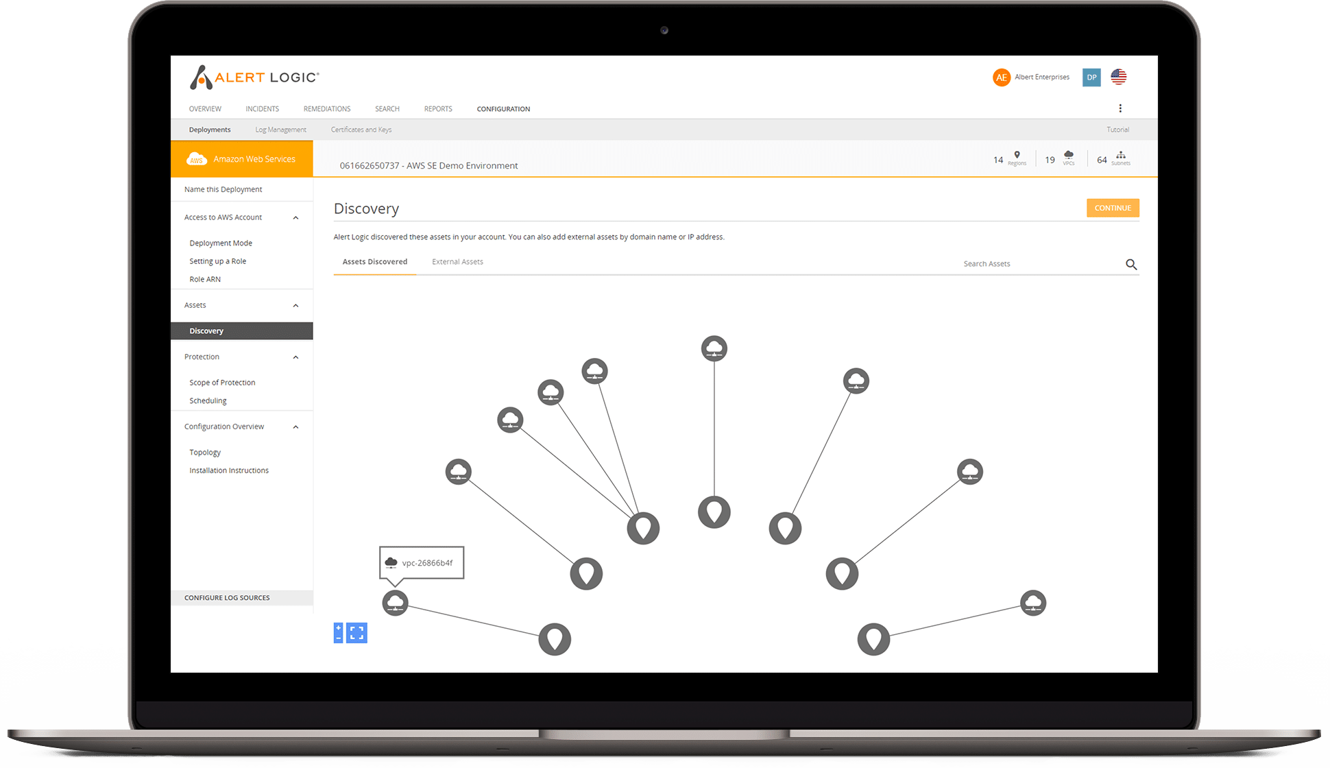
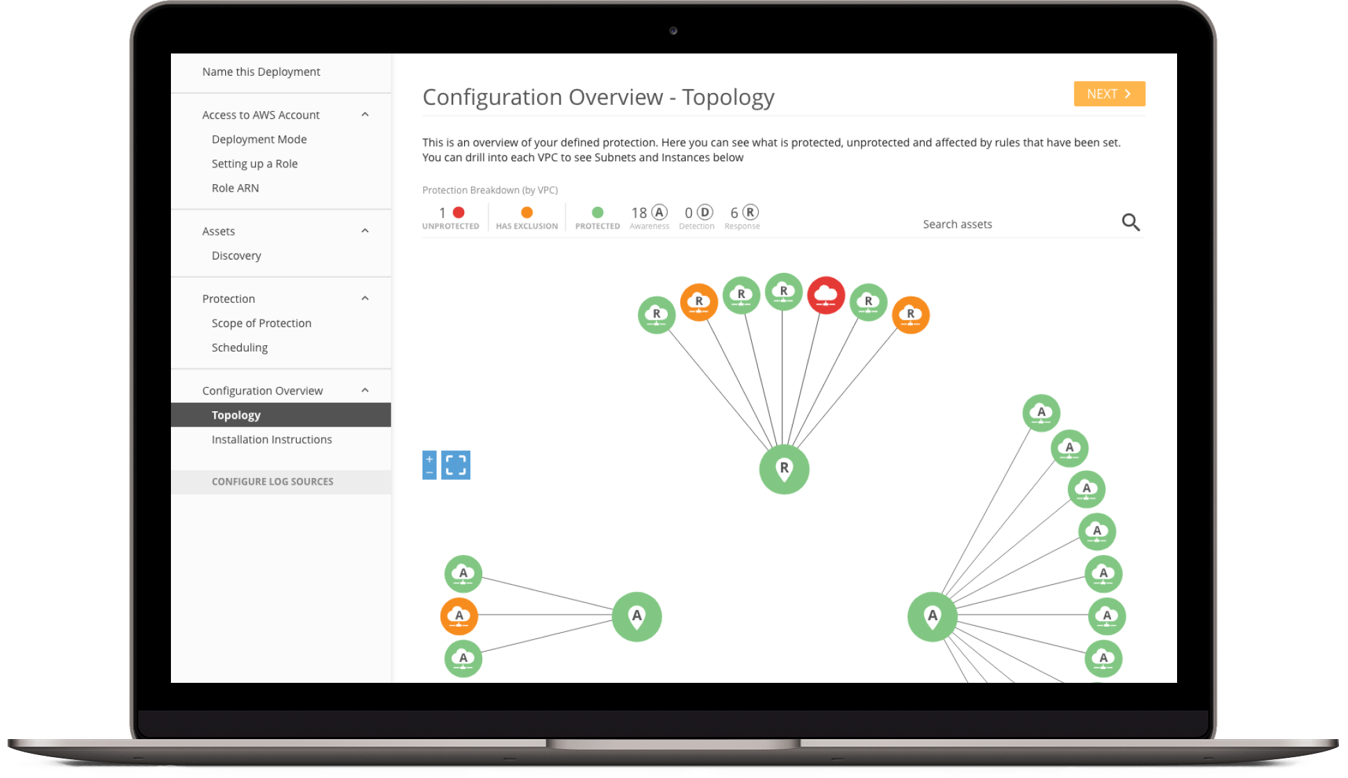
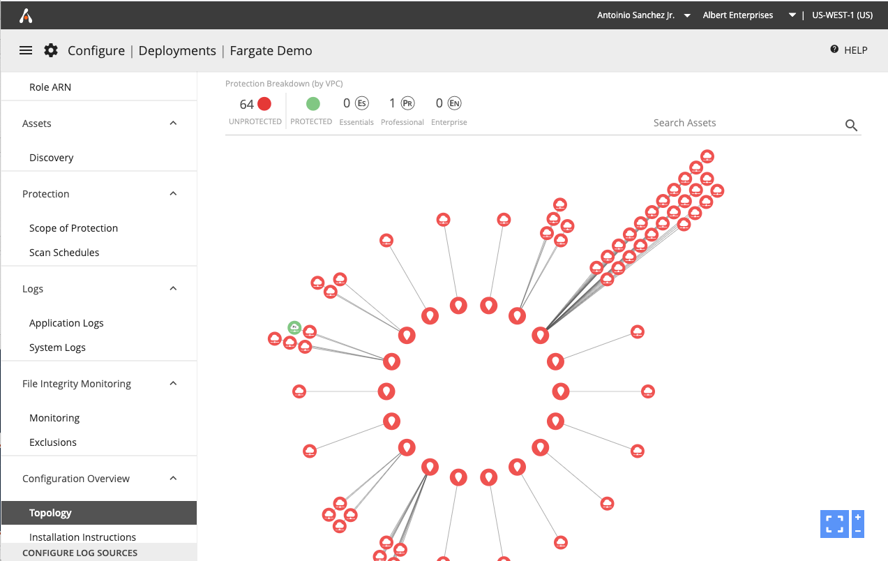
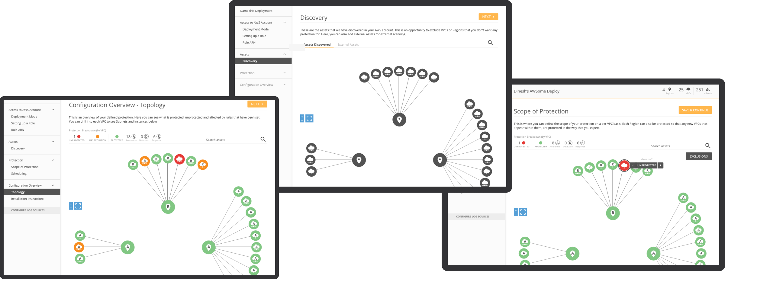
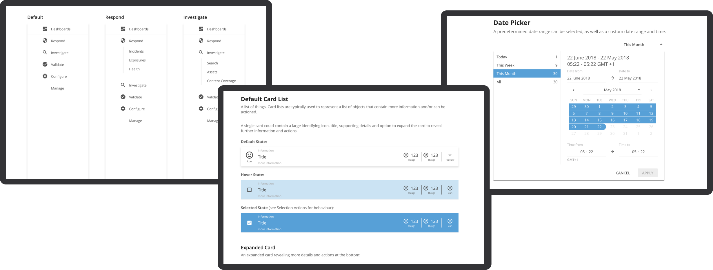
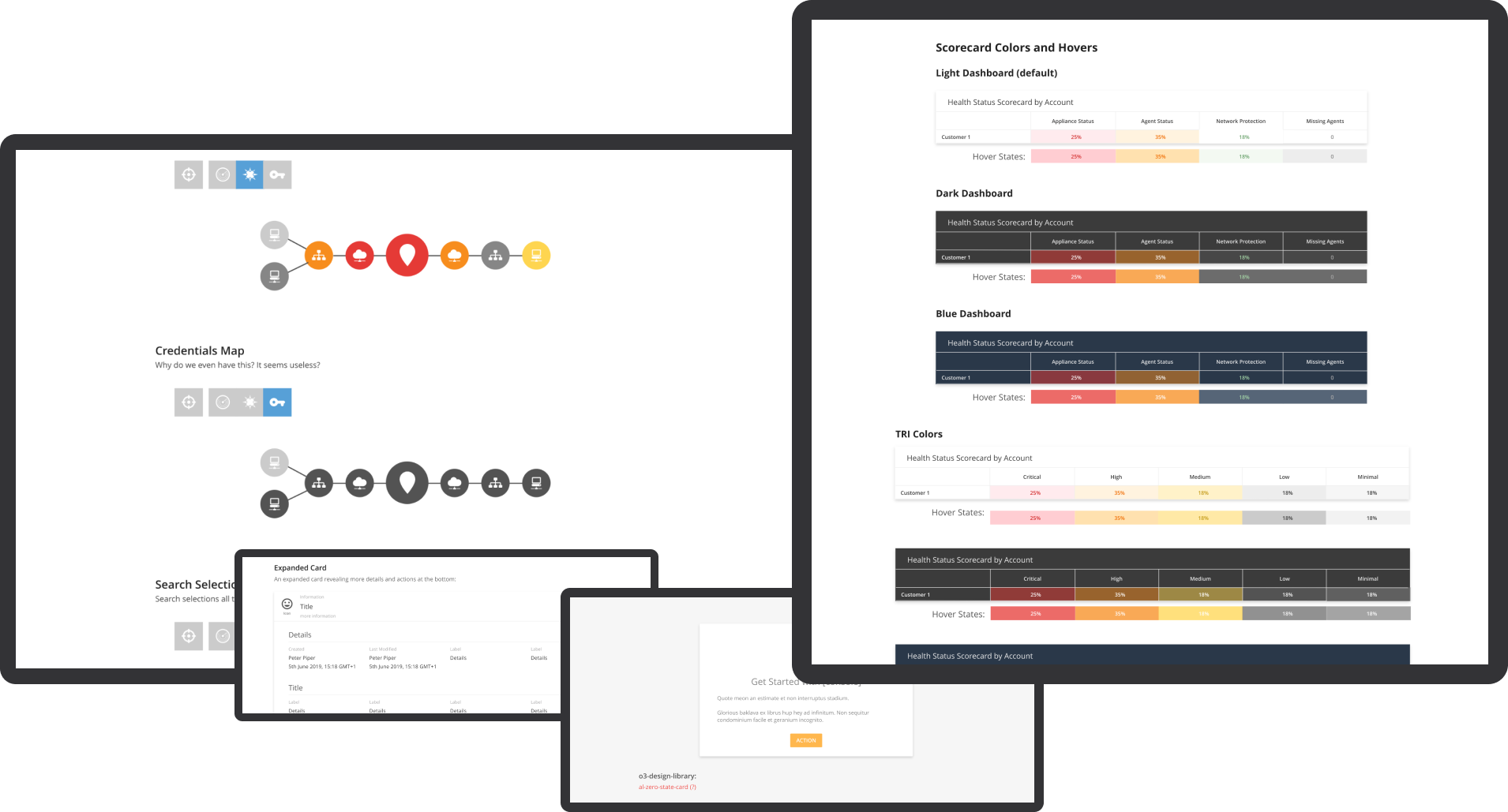
View of topology diagram with Rules applied.

Scheduling

By default, everything in the deployment will be scanned. Scheduling gives the customer the ability to control when scans occur. The customer can set times for Discovery Scans, Vulnerability Scans and PCI Scans. On the far right of the scan tabs is the customer's time zone in a dropdown. Here, the time zone can be changed, which will change all of the scheduled scans in this deployment to the new time zone.

This screen shows the Discovery Scan scheduling. The only option the customer will have is "Only scan during certain hours of the day".

When "Only scan during certain hours of the day" has been selected, more options will appear. The customer must select a 12-hour or 8-hour window and specify the start time.

If the customer has started entering information in any tab, they must "SAVE" or "CANCEL" before moving to another tab.

This screen shows the alert that appears when the customer tries to switch tabs without saving.

When each tabbed section has been saved and/or edited, the green "SAVED" button will display as a visual indicator for the customer. If they return to a tab and make edits, the button will return to the primary color until saved again.

This is the default screen for Vulnerability Scans. Here the customer has 3 options which will be elaborated on in the following screens.

Just like in Discovery Scans, the customer has the option to "Only scan during certain hours of the day". The customer has selected a 12-hour window.

They have also chosen to scan on certain days of the week and to blackout during popular holidays.

For "Only scan on certain days of every week" the customer has chosen to **not** scan on Monday. Scans will be performed on Sun, Tues, Wed, Thurs, Fri and Sat.

For "Blackout certain Public Holidays" the customer has selected the option to **not** scan on Black Friday.

This is the default screen for PCI Scans. The only option for this scan is "Only scan on these days of the month".

When selected, the default behavior is to have every day of the month selected.

Here the customer will have to select what days of the month they **don't** want to scan.

project: dashboards

portfolio

project overview

01

Problem Statement

In the complex and dynamic realm of cybersecurity, organizations are inundated with vast amounts of data pertaining to potential threats, vulnerabilities, and incidents. While having this data is crucial, it often overwhelms IT teams due to its sheer volume and complexity. The existing dashboards, although comprehensive, lack the flexibility for users to tailor visualizations to their specific needs. This limitation hinders the ability to swiftly understand and act upon the data, which is essential for maintaining a robust cybersecurity posture. The challenge lies in providing a solution that offers both depth and adaptability, enabling users to craft visualizations that resonate with their unique security landscape and operational requirements

Objective

To enhance the Alert Logic console with dashboards that not only provide a panoramic view of the cybersecurity landscape but also offer the granularity needed for in-depth analysis.

Challange

The challenge was to balance comprehensive visibility with the complexity of cybersecurity data, ensuring that users can easily navigate and interpret this information.

Proposal

02

To address this challenge, we propose the introduction of customizable dashboards within the Alert Logic console...

Custom Visualization Capability

Enabling users to create bespoke visualizations based on their specific data queries and analysis needs...

Minimum Set of Chart Types

To avoid overwhelming users and to streamline the development process, we estimate the need for a minimum of 9 essential chart types:

  1. Histogram: For distribution of numerical data.
  2. Area Plot: To show quantitative data over time.
  3. Stacked Area Plot: For comparing quantities over time across categories.
  4. Line Plot: For displaying trends and changes in data over time.
  5. Box Plot: To summarize data distributions across different categories.
  6. Bubble Plot: For representing three dimensions of data.
  7. Bar Plot: For comparing quantities across different categories.
  8. Heatmap: To show patterns of information or activity across two variables.
  9. Bubble Geo Map and Connection Geo Map: For geographic data visualizations.

Previous Dashboards

03

Before the integration of the new centralized dashboard system in the Alert Logic console, the cybersecurity management tools were dispersed across various individual consoles. Each of these previous dashboards was specialized but operated in isolation, which presented several challenges

  1. Fragmented View: Users had to navigate multiple systems to get a complete picture of their cybersecurity status, making the process time-consuming and less intuitive.
  2. Inconsistency in User Experience: With different interfaces across consoles, the user experience was inconsistent, potentially leading to confusion and errors in data interpretation.
  3. Limited Cross-Referencing: The ability to cross-reference data from different areas of cybersecurity was cumbersome, if not impossible, reducing the effectiveness of threat detection and response strategies.
  4. Increased Cognitive Load: Managing multiple systems simultaneously required higher cognitive effort, which could lead to user fatigue and decreased efficiency.

The development of a centralized dashboard system addresses these issues by consolidating all cybersecurity data into a single, unified interface. This centralization enhances visibility, streamlines the user experience, and improves the efficiency of security monitoring and management. The new dashboards are designed to not only provide a comprehensive overview of the cybersecurity landscape but also enable in-depth analysis with advanced filtering and search capabilities. This setup significantly enhances decision-making and operational agility, leading to more timely and effective cybersecurity management.

Previous Dashboards

Deliverables

04

The Alert Logic console dashboard enhancement project includes both visual and research components to provide a comprehensive understanding of the dashboard's capabilities. The key visual deliverables comprise high-quality images of the dashboard interface in three themes - dark, light, and blue modes - to ensure optimal visibility under different viewing conditions. These images will be accompanied by detailed visualizations of the nine essential chart types, including histograms, area plots, line plots, and more. The purpose of these visualizations is to demonstrate the dashboard's ability to represent complex cybersecurity data effectively.

Dashboard Modes

Additionally, the project includes an in-depth research component focused on Highcharts, a robust charting library that powers the visualizations within the dashboards. This research aims to align the chart types and functionalities offered by Highcharts with the specific needs of cybersecurity data representation. By integrating insights from this research, the dashboards are optimized for both functionality and aesthetics, ensuring that users have access to state-of-the-art tools for monitoring and analyzing cybersecurity threats effectively.

Together, these deliverables ensure that the enhanced Alert Logic console dashboards are not only visually appealing but also backed by solid research to maximize their effectiveness in real-world cybersecurity management scenarios.

key features

05

The enhanced dashboards within the Alert Logic console bring a suite of powerful tools to the forefront of cybersecurity management, each designed to target specific areas of security monitoring and incident response:

THREAT SUMMARY DASHBOARDS

These dashboards enable users to quickly identify and prioritize system vulnerabilities. They provide critical insights into potential security weak points and the urgency of actions needed, helping users effectively manage and mitigate risks.

VULNERABILITY SUMMARY DASHBOARDS

These dashboards enable users to quickly identify and prioritize system vulnerabilities. They provide critical insights into potential security weak points and the urgency of actions needed, helping users effectively manage and mitigate risks.

Firewall Log Volume Analysis Dashboard

Designed to analyze and dissect firewall logs, these dashboards offer detailed volume analysis and traffic insights. This functionality is crucial for detecting and responding to anomalies and security threats, enhancing overall network protection.

Firewall Log Traffic Analysis Dashboard

Designed to analyze and dissect firewall logs, these dashboards offer detailed volume analysis and traffic insights. This functionality is crucial for detecting and responding to anomalies and security threats, enhancing overall network protection.

File Integrity Monitoring Dashboards

These tools are essential for specialized web log analytics and file integrity monitoring. They highlight security incidents and changes in file systems, aiding in proactive threat detection and responsive measures.

Web Log Analytics Dashboards

These tools are essential for specialized web log analytics and file integrity monitoring. They highlight security incidents and changes in file systems, aiding in proactive threat detection and responsive measures.

Endpoint Protection and Threat Summary Dashboards

Focus on endpoint security and the broader threat landscape, these dashboards provide real-time data on malware detections, attack patterns, and incident responses. They are instrumental in guiding users to secure their networks more effectively.

TRI Summary Dashboard

In conclusion, this project represents a significant stride in making complex cybersecurity data accessible and actionable for users, leveraging advanced UX/UI design principles to empower organizations in their ongoing battle against cyber threats.

Conclusion

06

The integration of dashboards into the Alert Logic console marks a significant advancement in cybersecurity management. This enhancement focuses on streamlined data visualization and improving users' ability to quickly interpret and act on complex security information. With a curated set of chart types, the dashboards are designed to align with specific operational needs and security objectives.

This addition simplifies the console interface, reducing cognitive overload and enabling more efficient analysis of cybersecurity threats and vulnerabilities. It supports a proactive and dynamic defense posture, allowing organizations to swiftly adapt to the evolving threat landscape.

In summary, the implementation of dashboards in the Alert Logic console demonstrates our commitment to delivering user-centric, adaptable, and powerful cybersecurity solutions. This initiative will significantly enhance decision-making for IT teams, leading to more effective and timely cybersecurity management.

Design System & UI Library

portfolio
Design Systems

project overview

01

As a Senior UX Designer at Alert Logic, I spearheaded the creation and maintenance of a comprehensive design system and UI component library. This initiative was crucial in addressing the lack of visual consistency across the company's suite of cybersecurity products and enhancing our design workflows.

Challenge

I faced a major challenge due to the lack of a centralized design framework, which led to inconsistent user interfaces and a fragmented design process. The aim was to create a unified system to streamline design and development efforts, ensuring consistency and improving efficiency.

Solution

02

Developing the Design System

I started by thoroughly analyzing the current UI components, styles, and interactions. This analysis helped me identify important areas that required standardization and improvement. Drawing from industry best practices, I created a comprehensive set of reusable components, guidelines, and documentation that encompass typography, color palettes, spacing, iconography, and interaction patterns.

Building the Web Component UI Library

We created a custom Angular UI component library to keep a central collection of UI components. This ensured that designs and prototypes utilized the same resources as those implemented by UI developers, maintaining consistency and accurate representation of the final product.

Design Library

Integrating Storybook

We integrated Storybook to efficiently test, document, and share UI components with the development team. This tool enabled us to create high-fidelity prototypes in code, making it easy to transition into the development environment. This integration allowed design changes and styling edits to be prototyped, tested, and directly merged into

Design Library

Implementation and Training

I conducted training sessions for designers and developers to ensure the system's adoption. These sessions were crucial for educating the team on how to use and understand the system and for fostering a collaborative environment. Additionally, I set up a feedback loop to allow the team to contribute to the iterative refinement and enhancement of the design system.

Design Library

Result

03

Implementing the design system has significantly improved the design process at Alert Logic. It has enhanced collaboration among team members and ensured that all products have a consistent and user-friendly interface. The design system has also expedited development cycles, reduced duplication of effort, and enabled quicker decision-making, resulting in improved time-to-market for new features.

Design System Implementation

Raptor Technologies

04

Contribution to Raptor's Design Ecosystem

I was responsible for updating the Raptor Design System at Raptor Technologies. This involved aligning the Feather UI Storybook UI component app with the Raptor Design System Figma files to ensure consistent integration and platform-wide coherence. Through this experience, I honed my skills in managing and evolving design systems in varied settings, showcasing my adaptability and dedication to excellence in UX design.

These initiatives allowed me to showcase the transformative impact of a well-executed design system, highlighting my ability to lead complex projects and drive innovation in design and development processes.

Raptor Design System

portfolio
Design Systems

project overview

01

The Raptor Design System was fragmented, with components scattered across multiple Figma files and used inconsistently across various tech stacks—Vue, .NET, Angular Material, and PHP. This fragmentation led to inefficiencies in updating designs, inconsistent user experiences across platforms, and a misalignment between design and development. The challenge was further compounded by the need for cross-platform consistency across these different technologies.

Roles

02

The roles section offers an in-depth look at the various positions and responsibilities I undertook during the project. Each role underscores a distinct facet of my contributions and the unique skills I utilized, ensuring the project's success.

  1. Lead UI/UX Designer: Audited user interfaces to identify and resolve design inconsistencies.
  2. Design System Architect: Enhanced and expanded the design system for use across all teams and applications.
  3. Project Manager: Coordinated cross-functional teams to align with design goals.
  4. Usability Specialist: Improved usability and accessibility of the products.
  5. Quality Assurance: Ensured visual consistency and pixel-perfect alignment across applications.

Goals

02

Problem Statement

The design system lacked a centralized structure, with components spread across files and inconsistently applied across tech stacks (Vue, .NET, Angular Material, and PHP). Without a unified approach, scaling the system or maintaining consistency became increasingly complex, slowing down development and leading to discrepancies between design and implementation.

Objective

To unify scattered components into a single Figma file, introduce variables and primitives for scalable design tokens, and ensure cross-platform alignment by integrating the design system into multiple tech stacks (Vue, .NET, Angular Material, and PHP). This would ensure consistency, scalability, and more efficient collaboration between design and development teams.

Challenges

02

Component Fragmentation:

Components were scattered across multiple Figma files, creating inconsistency and inefficiency in design updates.

Multiple Design Library Files

Old Design Library

Tech Stack Alignment:

The design system needed to function consistently across multiple tech stacks (Vue, .NET, Angular Material, and PHP), each with its own development nuances and implementation methods.

Comprehensive Audit of all Proudcts and Tech Stacks

Raptor Audit

Scalability Issues:

Without a system of variables and primitives, managing updates across components was time-consuming and error-prone.

No Magical Stuff

No Fun Stuff

Cross-Platform Discrepancies:

Ensuring that design components translated accurately and consistently across the different development environments was critical to creating a cohesive user experience.

Differences in UI Elements

Raptor Copmonent Audit

Proposal

02

Unification and Cross-Platform Alignment of the Raptor Design System

To address the fragmentation and inefficiencies in the Raptor Design System, our approach focused on three core pillars: unification of components, scalability through design tokens, and cross-platform alignment. By partnering with another designer, we ensured that both the design and development aspects were fully considered, resulting in a comprehensive solution that improved both team collaboration and product consistency.

Collaborative Unification of Components

Our first step was to tackle the fragmentation of components across multiple Figma files. Working closely with another designer, we conducted a thorough audit of all existing design assets, identifying redundancies and inconsistencies. We collaborated to bring these scattered components into a single, unified Figma file, restructuring the design system for ease of use. This consolidation not only streamlined the design process but also allowed the entire team to work from a shared source of truth, reducing confusion and ensuring uniformity across all design elements.

By centralizing the components, we were able to create a scalable, modular system where updates to a component in the unified file automatically reflected throughout the entire product suite. This saved time, reduced errors, and improved overall design consistency across teams and product lines.

Sample of New Components

Updated Components

Table Component

Updated Components

Table Row Component

Updated Components

Table Cell Component

Updated Components

Scalability Through Variables and Primitives

With the unified component library in place, we focused on creating a scalable foundation using design tokens. We worked together to define core elements such as color palettes, typography, spacing, and layout principles as variables and primitives in Figma. This approach allowed us to develop a flexible and future-proof design system where these core tokens could be reused across all components, ensuring that any design updates would automatically cascade throughout the system.

By employing variables and primitives, we not only streamlined the design workflow but also laid the groundwork for scalability—whether for minor visual tweaks or large-scale updates. These tokens became the building blocks of the design system, offering flexibility and consistency, while drastically reducing the effort required for maintaining and updating the design assets.

Cross-Platform Alignment: Vue, .NET, Angular Material, and PHP

One of the most complex aspects of the proposal was ensuring that the design system could be consistently applied across multiple tech stacks. With Raptor Technologies utilizing Vue, .NET, Angular Material, and PHP, it was critical to align the design system across these diverse platforms. Working closely with the development teams, I ensured that the Figma components were compatible with each of these stacks.

I collaborated with the developers to integrate the design tokens, ensuring that the same variables and primitives defined in Figma could be implemented seamlessly in code. This not only maintained visual consistency across the platforms but also optimized the handoff between design and development. By bridging the gap between design and technology, we created a system where design components looked and behaved consistently, regardless of the tech stack they were deployed on.

Unify Variables

Next Steps: A Work in Progress

04

Figma and Storybook Alignment for Seamless Collaboration

To further reinforce consistency, the next step is to align components, styles, and design tokens in Figma with the Storybook component libraries used by development teams. Storybook will serve as the live repository of UI components, and aligning it with Figma will ensure that any changes in the design system are instantly reflected in development without requiring extensive manual updates. This alignment is intended to foster a seamless handoff, allowing both designers and developers to work more efficiently, with fewer miscommunications and design-to-development discrepancies.

Integrating Figma and Storybook as a single source of truth will help ensure that UI components are not only visually consistent but also functionally aligned across both design and code.

Converting Storybook Vue Components into Web Components for Cross-Stack Usability

With the Raptor Design System unified across multiple tech stacks, the next phase of the project will focus on maximizing the flexibility and reusability of design components. This involves converting the existing Vue components in Storybook into web components, which will enable seamless use across all tech stacks—Vue, .NET, Angular Material, and PHP.

Rapid Prototyping: Endpoints

portfolio

project overview

01

At Alert Logic, we continuously strive to improve our user interfaces to enhance usability and performance. The need for a modern, efficient, and user-friendly Endpoints console led us to develop a rapid prototype using custom components from our UX team. This prototype was created in code, leveraging our integrated Angular UI component library and Storybook, ensuring a seamless transition from design to implementation.

Utilizing Custom Components for Rapid Prototyping

Using custom components developed by our UX team, I built a rapid prototype for the Endpoints console. The goal was to create easy-to-implement deliverables for the UI team, ensuring a quick and smooth handoff. By utilizing Storybook, we were able to test, document, and share these components efficiently.

Key pages updated

02

Endpoints Summary Page

  1. Legacy Version: The old interface was cluttered and difficult to navigate, with outdated styling and limited functionality.
  2. Updated Version:The new design offers a cleaner, more intuitive layout with enhanced features and better data visualization.
Legacy
Legacy
Updated
Updated

Events List Page

  1. Legacy Version: The old events list was cumbersome to navigate and lacked efficient data handling capabilities.
  2. Updated Version:The new events list offers streamlined navigation, better data management, and an updated look that aligns with the rest of the console.
Legacy
Legacy Page
Updated
Uppdated

Endpoints Detail Page

  1. Legacy Version: The detail page lacked clarity and actionable insights, making it hard for users to find the information they needed.
  2. Updated Version:The revamped page includes better-organized data, clearer insights, and actionable information presented in a user-friendly manner.
Legacy
Legacy
Updated
Updated

Impact and Benefits

03

Rapid Implementation

The UI team was able to rapidly implement the changes from the prototype, thanks to the well-documented and easy-to-adapt components provided. This efficiency not only sped up the development process but also ensured that the new designs were consistent and high-quality.

Setting a Standard

This project served as a benchmark for replacing all tables across our product with the improved versions. The clear, functional, and aesthetically pleasing tables set a new standard for future updates and enhancements.

Seamless Design and Development Integration

The integration of Storybook in our design and development workflow proved invaluable. It facilitated better collaboration, faster prototyping, and ensured that our design assets were always up-to-date and accurately represented in the final product.

Conclusion

04

The rapid prototype for the Endpoints console exemplifies the power of combining custom component development with tools like Storybook. This approach not only streamlined our design-to-development process but also resulted in a significantly improved user interface. The success of this project underscores the importance of efficient prototyping and the benefits of a robust design system in delivering high-quality, user-friendly products.

Raptor Dismissal Management

portfolio
Dismissal Management Dashboard on Different Devices

project overview

01

At Raptor Technologies, I played a pivotal role in the Dismissal Management project, integrating a newly acquired product into the existing Raptor suite. My contributions ensured the new product adhered to Raptor's design standards, enhancing overall user experience and functionality.

Roles

02

The roles section offers an in-depth look at the various positions and responsibilities I undertook during the project. Each role underscores a distinct facet of my contributions and the unique skills I utilized, ensuring the project's success.

  1. Lead UI/UX Designer: Spearheaded the redesign of key pages, ensuring they adhered to Raptor's design standards and improved user experience.
  2. Design System Architect: Enhanced and extended the existing design system, creating scalable UI elements and ensuring consistency across the product suite.
  3. Project Coordinator: Collaborated with cross-functional teams, including developers, product managers, and stakeholders, to ensure seamless integration and alignment with project goals.
  4. Usability Specialist: Collaborated with stakeholders to conduct usability reviews and prototyping, gathering feedback to iteratively improve designs with a focus on user-centered design principles.
  5. Quality Assurance: Ensured pixel-perfect alignment and visual consistency across all applications by meticulously refining UI elements.

Goals

03

The primary objectives of the project were to enhance the design system and user experience across Raptor Technologies' diverse product suite. These goals were focused on ensuring consistency, usability, scalability, efficiency, accessibility, and alignment, thereby creating a seamless and cohesive user interface that meets high standards of design and functionality.

  1. Consistency: Ensure all UI elements and new product integrations adhere to Raptor’s established design patterns and branding guidelines.
  2. Usability: Enhance the overall user experience by improving the layout, navigation, and visual design of key pages.
  3. Scalability: Create scalable UI elements and design patterns that can be easily adapted for future products and updates.
  4. Efficiency: Reduce the time and effort required for new application integration and maintenance by enhancing the design system and creating reusable components.
  5. Accessibility: Identify and address usability and accessibility issues to ensure all products meet high standards for user experience.
  6. Alignment: Align new and existing products within the Raptor System, providing recommendations for improvements and ensuring cohesive integration.

wireframing and styling

04

During the project, I played a pivotal role in integrating SchoolPass into Raptor as Dismissal Management, ensuring the new product adhered to Raptor’s design standards and components.

Wireframes in Miro

Auditing the School Pass app and created detailed wireframes in Miro that merged SchoolPass into Raptor as Dismissal Management, illustrating how the product would function within Raptor’s product shell. This step was crucial in visualizing the integration and aligning it with Raptor's design standards.

Proof of Concept Styling

Styled the SchoolPass pages directly in the browser as a proof of concept to demonstrate the ease with which the product could be adapted using SchoolPass's existing tech stack (Angular Material). This showcased the feasibility of the integration and set a clear direction for the styling process.

Browser Styles Proof of Concept

Component Styling and Optimization

Delved into the Dismissal app repository to theme and style all components (buttons, forms, tables, grids, etc.) using SASS and mixins. Improved HTML markup to reduce redundancy in styles and markup, significantly enhancing the efficiency and maintainability of the codebase. This meticulous optimization enabled the UI team to seamlessly integrate the backend into the frontend.

Component Theming and Optimization

Final Product Deliverables

05

Redesign of Key Pages

Redesigned the product to ensure consistency with Raptor’s design patterns and components. This involved updating layouts, improving navigation, and enhancing visual design elements to create a more intuitive and cohesive user experience.

Dashboard Section

  • Before: The original dashboard had an outdated layout with inconsistent design elements, making it difficult for users to quickly access important information. Navigation was cumbersome, and the visual hierarchy was unclear.
  • After: The redesigned dashboard features a modern layout aligned with Raptor patterns and components. Consistent design elements, improved navigation, and better organization of information significantly enhance the overall user experience.
Before
Dashboard Before Redesign
After
Dashboard After Redesign

Students Section

  • Before: The initial students section had a cluttered interface with poor navigation, making it challenging for users to find and manage student information. The inconsistent styling further hindered usability.
  • After: The updated students section now has a clean and intuitive layout with improved navigation, all aligned with Raptor’s design patterns and components. This makes it easier for users to access and manage student information, leading to improved efficiency and satisfaction. The details section of the Students has been restyled to match the Raptor Platform better. This involved improving the layout and visual design to enhance usability and accessibility.
Before
Students Section Before Redesign
After
Students Section After Redesign

Carline Section

  • Before: The previous carline section had an inconsistent layout and lacked clear visual hierarchy, which negatively affected user efficiency. Navigation was not intuitive, causing confusion.
  • After: The redesigned carline section includes a streamlined layout with clear visual hierarchy, all aligned with Raptor patterns and components. Improved navigation and cohesive design elements enhance user efficiency and overall experience.
Before
Carline Section Before Redesign
After
Carline Section After Redesign

Buses Section

  • Before: The buses section had a confusing interface with inconsistent styling and navigation issues that hindered usability. Users found it difficult to manage bus routes and schedules effectively.
  • After: The updated buses section has a unified design with consistent styling and improved navigation, in line with Raptor’s design patterns and components. This improves usability and user satisfaction, making it easier to manage bus routes and schedules. The functionality for managing pickup areas and bus routes has been enhanced. This involved designing intuitive interfaces for adding, editing, and deleting pickup areas and bus routes, as well as configuring related settings such as bus drivers, stops, and capacity.
Before
Buses Section Before Redesign
After
Buses Section After Redesign

Activities Section

  • Before: The old activities section was visually cluttered and difficult to navigate, leading to a suboptimal user experience. Important information was hard to locate, causing frustration.
  • After: The redesigned activities section offers a clean, organized interface with improved navigation, all aligned with Raptor patterns and components. This involved updating grid styles, filters, and overall page layout to provide a cohesive and intuitive user experience, making it easier to find and manage activities.
Before
Activities Section Before Redesign
After
Activities Section After Redesign

Dismissal Section

  • Before: The dismissal section had an outdated interface with inconsistent design elements, making it hard for users to efficiently manage dismissal processes.
  • After: The updated dismissal section has a cohesive design aligned with Raptor’s design patterns and components. It features improved usability and a more intuitive layout, making it easier for users to manage and track dismissal processes efficiently. Additionally, the interface for managing dismissal schedules, including creating and editing dismissal times, locations, and related settings, has been improved. These changes have made it easier for administrators to configure and manage dismissal processes.
Before
Dismissal Section Before Redesign
After
Dismissal Section After Redesign

Reports Section

  • Before: The reports section had an outdated design with poor layout and navigation, making it hard for users to access and understand reports. The inconsistent styling added to the confusion.
  • After:The updated reports section features a modern design with an improved layout and enhanced navigation, all aligned with Raptor’s design patterns and components. This makes it easier for users to access and interpret reports, improving overall user satisfaction.
Before
Reports Section Before Redesign
After
Reports Section After Redesign

Conclusion

06

This project significantly strengthened the Dismissal Management product and enhanced the overall user experience across Raptor Technologies' offerings. By ensuring a unified and efficient system for managing school dismissals, I contributed to creating a safer and more organized environment for schools. The enhancements made during this project set a strong foundation for future growth and development within the Raptor product suite.

Key Outcomes

  1. Improved User Experience: The redesign of key pages and interfaces aligned with Raptor’s design patterns and components greatly improved the user experience, making the system more intuitive and accessible.
  2. Consistency and Scalability: The enhancements to the design system ensured consistency across all applications and created scalable UI elements that can be easily adapted for future products and updates.
  3. Efficient Integration: The meticulous optimization of components and styling ensured a seamless integration of the newly acquired product into the existing Raptor suite, reducing time and effort for maintenance and new application incorporation.
  4. Enhanced Usability and Accessibility: Addressing usability and accessibility issues ensured that all products met high standards for user satisfaction, making the system more user-friendly for diverse user groups.
  5. Streamlined Management: Improvements in dismissal schedule management, pickup areas, bus routes, and notification settings provided administrators with powerful tools to efficiently manage school dismissals, enhancing the overall functionality of the system.

Personal Impact

  1. Leadership and Collaboration: Leading the redesign and integration efforts, I collaborated effectively with cross-functional teams, including developers, product managers, and stakeholders, ensuring seamless project execution and alignment with goals.
  2. Innovation and Problem-Solving: Through innovative wireframing, proof of concept styling, and meticulous optimization, I demonstrated my ability to solve complex design challenges and deliver high-quality, scalable solutions.
  3. Commitment to Excellence: My commitment to achieving pixel-perfect alignment and visual consistency across all applications underscored my dedication to excellence in design and development.

The successful completion of this project not only showcased my expertise in UI/UX design, design system architecture, and project coordination but also reinforced Raptor Technologies' reputation for delivering robust and user-friendly solutions in the education technology space.

By integrating SchoolPass into Raptor as Dismissal Management and enhancing the overall design system, I helped create a more cohesive and efficient product suite that better serves the needs of schools, administrators, and students.

Summary

In summary, my work on the Dismissal Management project at Raptor Technologies involved a comprehensive redesign of key pages, enhancing the design system, and ensuring seamless integration of a newly acquired product. These efforts resulted in a significantly improved user experience, greater consistency and scalability, and more efficient management of school dismissals, ultimately contributing to a safer and more organized environment for schools.

By leveraging my expertise in UI/UX design and collaboration, I was able to deliver high-quality, impactful results that aligned with Raptor’s design standards and set the stage for future growth and innovation within the product suite.

Project Van Gogh

portfolio
Design Systems

project overview

01

Project Van Gogh was an initiative to completely redesign Raptor Technologies’ suite of products and unify the design system with Figma. This effort focused on establishing a cohesive visual and functional experience across all applications by integrating a new design system and design tokens. Through close collaboration with the design and development teams, we ensured that the unified system translated seamlessly across platforms, enhancing both design consistency and scalability.

Roles

02

In collaboration with my team, I contributed to the integration of the new design system across all Figma files. My key responsibilities included:

  1. Design System Integration: Unifying product designs within Figma, using scalable design tokens for cross-platform consistency.
  2. Product Redesign: Implementing a modernized look and feel across the suite, aligned with Project Van Gogh’s objectives.
  3. Cross-Team Collaboration: Working closely with developers to streamline the handoff process and maintain design integrity across different platforms.

Goals

02

Problem Statement

The existing product designs were fragmented and inconsistent, making updates challenging and resulting in a disjointed user experience. Project Van Gogh aimed to address these issues by aligning all product designs under a cohesive, scalable design system.

Objective

To unify the suite of products in Figma, leveraging design tokens for scalability and ensuring a consistent, modern user experience. This unified approach aimed to improve collaboration between design and development teams, making design updates more efficient.

Challenges

02

  1. Inconsistent Design Components:Fragmentation across Figma files led to inefficiencies and inconsistent user experiences.
  2. Lack of Scalability: Without a token-driven system, maintaining design updates across products was labor-intensive.
  3. Cross-Platform Consistency::Ensuring accurate implementation of the design system across different tech stacks required close coordination with development.

Proposal

02

Our solution was structured into three core areas:

  1. Centralization of Figma Assets: All product designs were consolidated in Figma under the design system, creating a single source of truth for all teams.
  2. Token-Based Scalability: Core design tokens for color, typography, and spacing were applied across components, enabling scalable, consistent updates.
  3. Cross-Platform Collaboration: Close alignment with development teams allowed for smooth design-to-code handoff, ensuring components were visually consistent across platforms.

Key Contributions & Highlights

04

Figma Design Library Updates

Created a dedicated branch in Figma to apply updates across all components, ensuring they adhered to the new product redesign standards.

Updated and Unified Components

Applied design system updates to all components, aligning them with the new visual and functional guidelines.

Redesigned Existing Applications

Migrated and updated existing apps from their original Figma files to incorporate the new components and design principles.

Enhanced Future Scalability

Built components with scalability in mind, leveraging design tokens to ensure easy adaptation to future updates and changes.

Next Steps: A Work in Progress

04

Converting Storybook Vue Components into Web Components for Cross-Stack Usability

With the Raptor Design System now unified and aligned across multiple tech stacks, the next phase of the project is focused on maximizing the flexibility and reusability of the design components. The goal is to convert the existing Vue components in Storybook into web components, enabling them to be used seamlessly across all tech stacks—Vue, .NET, Angular Material, and PHP.

Product Design Audit

portfolio

project overview

01

At Raptor Technologies, I led a comprehensive design audit and enhancement initiative across their diverse product suite to ensure visual consistency, usability, and scalability. Leveraging my extensive experience from Alert Logic, I aimed to integrate and modernize the design systems across various applications, ensuring they adhered to Raptor’s stringent design standards and provided a seamless user experience.

Roles

02

The roles section offers an in-depth look at the various positions and responsibilities I undertook during the project. Each role underscores a distinct facet of my contributions and the unique skills I utilized, ensuring the project's success.

  1. Lead UI/UX Designer: Audited user interfaces to identify and resolve design inconsistencies.
  2. Design System Architect: Enhanced and expanded the design system for use across all teams and applications.
  3. Project Manager: Coordinated cross-functional teams to align with design goals.
  4. Usability Specialist: Improved usability and accessibility of the products.
  5. Quality Assurance: Ensured visual consistency and pixel-perfect alignment across applications.

Goals

03

The primary objectives of the project were to enhance the design system and user experience across Raptor Technologies' diverse product suite. These goals were focused on ensuring consistency, usability, scalability, efficiency, accessibility, and alignment, thereby creating a seamless and cohesive user interface that meets high standards of design and functionality.

  1. Consistency: EStandardized UI elements and integrated new products with existing design patterns.
  2. Usability: Enhanced layout, navigation, and visual design for a better user experience.
  3. Scalability: Developed scalable UI components for future product adaptations.
  4. Efficiency: Streamlined integration and maintenance through reusable components.
  5. Accessibility: Addressed usability and accessibility issues to uphold high user experience standards.
  6. Alignment: Ensured cohesive integration of new and existing products within the Raptor System.

Key Contributions & Highlights

04

Throughout the product design audit and improvement initiative at Raptor Technologies, I made several key contributions that significantly enhanced the visual consistency, usability, and scalability of the product suite. By conducting a thorough audit of existing UI elements, reviewing and integrating new applications, recommending design enhancements, standardizing base UI elements, assisting in the incorporation of new products, and extending the design system, I ensured a cohesive and efficient design framework. Below are the detailed highlights of my contributions:

Audit Existing UI

I conducted a thorough audit to identify design patterns and discrepancies in all applications. This involved analyzing different UI components, including headers, footers, sidebars, and main content areas, in order to establish a standard set of elements in use. I documented any inconsistencies, usability issues, and opportunities for improvement, and created a detailed report highlighting common patterns and discrepancies.

Review and Integrate New Applications:

Reviewed new applications to ensure they aligned with Raptor's design standards. I then provided recommendations for design enhancements to improve usability and visual appeal, aligning with established design patterns.

Recommend Enhancements

Scalable and accessible design patterns were suggested to align all products within the Raptor System, with a focus on creating a cohesive user experience. Additionally, mockups and diagrams were developed to visualize the proposed enhancements, facilitating clear communication of the design improvements to stakeholders and development teams.

Align Base UI Elements

Standardized base UI elements across all applications and environments to ensure consistency in design and functionality. Implemented changes to align elements such as buttons, forms, and navigation components with the updated design system.

Incorporate New Products

Assisted in integrating new products into the Raptor System to ensure they met high standards of design and usability. Provided design support and guidance to product teams to facilitate the seamless incorporation of new products into the existing ecosystem.

Extend Design System

Expanded the design system by adding scalable elements that could be used universally by all teams, promoting efficiency and consistency in design. Additionally, I created detailed design documentation and guidelines to ensure that the design system could be easily adopted and implemented across different projects and teams.

Through these key contributions, I ensured that Raptor Technologies' product suite maintained a high standard of visual consistency, usability, and scalability. By auditing existing UI elements, reviewing new applications, recommending enhancements, and extending the design system, I created a cohesive and efficient design framework that streamlined the integration of new products and facilitated ongoing maintenance. My efforts contributed to a robust, user-centric design system that supported Raptor's goals of delivering exceptional user experiences across all their products.

Summary

03

Through a detailed design audit and systematic enhancement process, I ensured that Raptor Technologies' product suite maintained a high standard of visual consistency, usability, and scalability. By conducting an extensive audit of existing UI elements, I identified and resolved discrepancies, creating a more unified and cohesive design language across all products. My role involved not only reviewing and integrating new applications into the existing system but also recommending and implementing scalable and accessible design patterns.

Key Achievements

  1. Enhanced Visual Consistency: By standardizing design elements and resolving inconsistencies across applications, I established a uniform visual identity that reinforced Raptor's brand integrity and improved user recognition.
  2. Improved Usability: Focused on enhancing the overall user experience by refining the layout, navigation, and visual design of key pages. This resulted in a more intuitive and user-friendly interface, making it easier for users to interact with the products.
  3. Scalability and Flexibility: Developed scalable UI components and design patterns that can be easily adapted for future product updates and new developments. This approach ensured that the design system remained flexible and could accommodate growth and change without compromising on quality or consistency.
  4. Efficient Integration and Maintenance: Streamlined the process of integrating new applications and maintaining existing ones by enhancing the design system and creating reusable components. This efficiency reduced the time and effort required for these tasks, allowing teams to focus on innovation and development.
  5. Accessibility Improvements: Identified and addressed usability and accessibility issues, ensuring that all products met high standards for user experience. This commitment to accessibility made Raptor's products more inclusive and accessible to a wider audience.
  6. Cohesive Design Framework: Created a cohesive design framework that aligned new and existing products within the Raptor System. By recommending and implementing design enhancements, I ensured that all products worked together seamlessly, providing a consistent and reliable user experience.

Impact

The comprehensive design audit and enhancement efforts led to a significant improvement in the overall quality of Raptor Technologies' product suite. The unified design system facilitated better collaboration among teams, as everyone could rely on a consistent set of design principles and components. This not only enhanced the visual and functional quality of the products but also accelerated the development process, allowing Raptor to bring new features and updates to market more quickly.

The improved usability and accessibility of the products resulted in higher user satisfaction and engagement, as users found it easier to navigate and interact with the applications. The scalable design patterns ensured that Raptor's design system could grow with the company, supporting future innovations without requiring extensive rework.

Conclusion

In summary, my contributions to the product design audit and improvement initiative at Raptor Technologies resulted in a robust, scalable, and user-centric design framework. This framework not only enhanced the current product suite but also laid a strong foundation for future developments. The improved design system and cohesive integration of new products set a new benchmark for visual and functional consistency, making Raptor's products more reliable, enjoyable, and accessible for users.

Raptor Dismissal Management

portfolio

project overview

01

Proposal

02

Previous Dashboards

03

Previous Dashboards

Deliverables

04

key features

05

Conclusion

06

Storybook in Alert Logic's Design System

portfolio

project overview

01

At Alert Logic, we recognized the need to overhaul our design system to achieve better control, flexibility, and synchronization between our design tools (Adobe XD, Figma) and the development process. Our solution was to create a custom Angular UI component library, integrated with Storybook, to bridge the gap between design and implementation effectively.

Challanges and Solutions

02

Overcoming Limitations of Standard Design Tools

We faced significant challenges with Adobe XD and Figma, where UI components and styles frequently became outdated or misaligned with what developers were using. Additionally, reliance on third-party design systems like Material UI and PrimeNG limited our ability to tailor components to our specific needs. To address these issues, we decided to take a more controlled approach by developing our own Angular UI component library.

Building a Web Component UI Library

The new Web Component UI library was designed with the flexibility to adjust and iterate components in-house as needed. This approach allowed us to maintain a shared repository of UI components, ensuring that designs and prototypes used the same assets as those implemented by UI developers. This consistency guaranteed that prototypes presented to stakeholders and the development team accurately represented the final product.

Integrating Storybook

03

Utilizing Storybook for Documentation and Testing

Storybook played a pivotal role in our design system by allowing us to test, document, and share UI components with the development team efficiently. With Storybook, we could create high-fidelity prototypes in code, facilitating seamless transitions into the development environment. This integration made it possible for design changes and styling edits to be prototyped, tested, and then directly merged into the component library without additional implementation effort from developers.

Empowering Rapid Prototyping in Code

A key goal of integrating Storybook was to empower our US-based team to develop rapid prototypes in code. This capability significantly accelerated the prototyping process, enabling quicker feedback cycles and iterative development. It ensured that our prototypes were not only visually consistent with the final product but also functional, providing a real-world test of user interactions and system performance.

Benefits of Storybook Integration

By taking control of our design system through to the UI components, we ensured a consistent design style and harmony across every interface element. The use of Storybook enabled shareable, high-fidelity prototyping that developers could easily adapt for production. This tool not only simplified the design and testing processes but also proved invaluable in documenting our custom components, which were designed to be platform-agnostic and adaptable to various environments.

Conclusion

04

The adoption of Storybook transformed the way we managed our UI component library at Alert Logic. It allowed for greater collaboration between designers and developers, reduced time-to-market for new features, and ensured that our digital products maintained a consistent and user-friendly interface. Through this integration, we established a robust, flexible, and highly efficient design system that continues to support our cybersecurity solutions effectively.

my portfolio

works

Crafting Experiences with Purpose

Designing

My journey in digital design spans two decades of evolution in technology and user expectations. At Raptor Technologies, I focus on creating solutions that protect and empower educational communities. Every project is an opportunity to combine aesthetic excellence with meaningful impact.

Expertise
  1. Turning complex challenges into intuitive, user-friendly solutions
  2. Bridging the gap between design vision and technical reality through scalable design systems and component libraries
  3. Evolving legacy platforms into modern, accessible solutions that delight users while improving operational efficiency
Approach
  1. Building cohesive design languages that ensure consistent, predictable experiences across every touchpoint
  2. Balancing powerful functionality with simplicity - creating tools that are both capable and approachable
  3. Championing user needs through research-driven design decisions and continuous validation with real users

My Design Philosophy

Great design is invisible. It's the seamless experience that helps users achieve their goals without friction or confusion. This belief guides every decision in my design process - from initial research to final implementation.

My Design Process

Discover
Discover
Conduct user research through interviews, surveys, and data analysis to gain empathy and understand real user needs. This step uncovers core problems and informs the design direction.
Define
Define
Synthesize research insights into clear user personas and problem statements. Define goals, scope, and success metrics, creating a solid foundation for the design process.
Design
Design
Translate insights into wireframes, prototypes, and visual designs. Focus on creating intuitive interfaces and user-friendly interactions that solve the identified problems.
Test
Test
Run usability tests with real users to validate design assumptions. Gather feedback on functionality, usability, and overall experience to ensure designs meet user and business goals.
Iterate
Iterate
Refine designs based on user feedback and testing outcomes. Make improvements to enhance usability and address any identified issues, continuously evolving the solution.
Repeat
Repeat
Apply an agile approach by repeating the design, test, and iteration cycle. Continue refining the product to ensure it remains aligned with user needs and business objectives.

Key Skills

Core competencies developed through years of hands-on experience designing complex systems and leading cross-functional teams.

UX/UI Design
Design Systems
Pattern Libraries
Usability & Accessibility
User Flows
Wireframing
Prototyping
Visual Design
Product Design
Performance Analysis
Cross-functional Team Collaboration

Technical Skills

A carefully curated toolkit that enables rapid prototyping, efficient collaboration, and precise implementation.

Adobe Creative Suite
Figma
Sketch
Axure
Miro
InVision
HTML5/CSS3
JavaScript
React
Angular
Vue.js
Node.js
Git

Experience

Throughout my career, I've focused on creating impactful solutions that improve how people work, learn, and stay safe. Each role has expanded my understanding of how design can drive both business success and social good.

2023 - Present

UI/UX DesignerRaptor

  • Design and maintain comprehensive style guides and component libraries for school safety management platform
  • Develop responsive interfaces and establish visual hierarchies across desktop platforms
  • Architect and document reusable component libraries ensuring crossplatform consistency
  • EImplement WCAG accessibility standards across digital products
  • Create high-fidelity prototypes demonstrating interactive elements
2014 - 2023

Senior UX EngineerAlert Logic

  • Unified nine product consoles through comprehensive design system implementation
  • Created and maintained detailed UI specifications and design patterns in Figma and Storybook
  • Designed complex security data visualizations for analytical dashboards
  • Built scalable icon libraries and visual asset management systems
  • Led cross-functional teams in implementing design system components
2008 - 2014

Lead UX/UI DesignerCranberry

  • Led design strategy for multiple early-stage products
  • Created intuitive interfaces for complex business applications
  • Built and maintained comprehensive design pattern libraries
  • Established clear design standards and documentation
2000 - 2008

Lead Graphic / Web DesignerPRWeb

  • Modernized front-end design system improving user engagement and atabase interactions
  • Developed systematic design approaches for digital and print platforms
  • Led comprehensive redesign efforts resulting in significant user interaction improvements
  • Established brand identity systems and guidelines

don't be shy !

Feel free to get in touch with me. I am always open to discussing new projects, creative ideas or opportunities to be part of your visions.

call me+1 360 393 0656
Pixel Juggle